Recreated for a11yTO Gaming 2020 viewers. Please note that the text may not perfectly match, as these are my notes. I’ll be sure to update, as needed. Thank you!
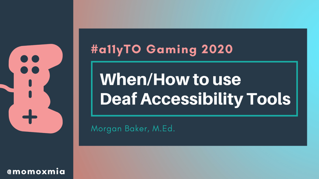
Hello everyone! My name is Morgan Baker, and today I’m going to talk about when and how to use Deaf Accessibility Tools. This presentation will specifically define some tools that promote deaf accessibility in video games, as well as outline when/how to integrate them into game design.
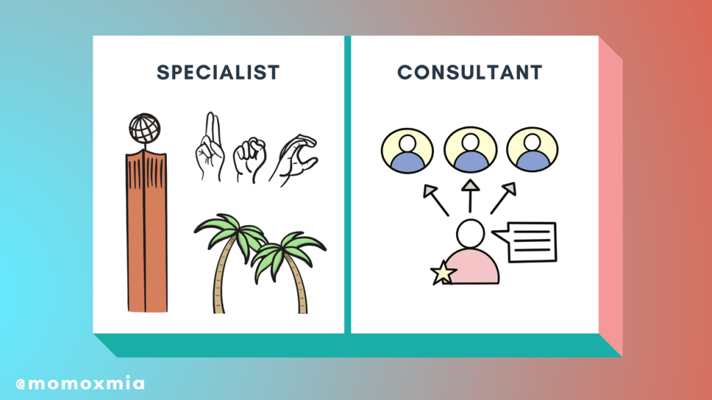
I’m going to start off by introducing myself. I am a full-time Disability Specialist for the University of Southern California, which is a large institution in Los Angeles.
In addition to this role, I provide accessibility consultation to varying studios, as needed. Most recently, I’ve worked with Naughty Dog for the Last of Us Part II. I am also a design consultant right now for Exploding Kittens and have recently worked on very small projects for companies such as Microsoft.
For my everyday role, I work with hundreds of people with disabilities to create equal access, ranging from mobility, medical, and cognitive disabilities all the way to blind, low vision, and unsurprisingly, deaf.
If there is one take away from this role that I emphasize again and again, it’s that there is no such thing as one disabled experience. This is especially true for those who are deaf and hard of hearing.
Some people are born deaf whereas others may lose their hearing later in life. Deafness itself is also a spectrum, and can range from mild to profound. Some people use hearing aids and/or know sign language, others perhaps cochlear implants, and many choose not to use any hearing device at all.
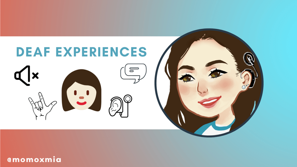
Take me for example! I went deaf in my teenage years and learned sign language, as well as currently have two cochlear implants and use my voice. But though some deaf people may relate to me, my experience is not identical to anyone else as we are all very different. So how can we design our games to be as accessible as possible to deaf and hard of hearing players?
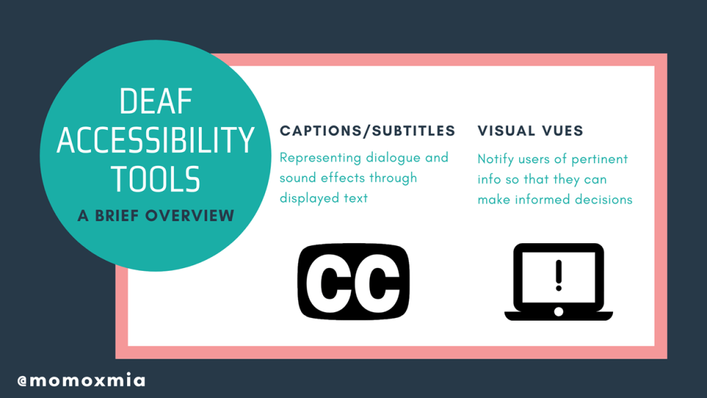
Today I will discuss the two major tools to promote deaf accessibility in video games are (1) captions/subtitles and (2) visual cues. This basic guide will define the tools and outline when/how to integrate them into game design. This presentation will include lots of helpful examples too.
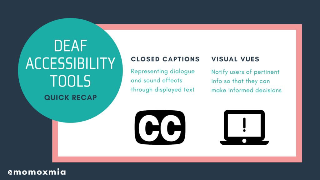
Closed captions represent dialogue and sound effects through displayed text. You might have seen them before while watching tv at a bar or playing a game where they are automatically turned on, such as Assassin’s Creed.
The other tool I will discuss are visual cues. Visual cues notify users of pertinent information so that they can make informed decisions. More so, these cues can range from color communication and awareness indicators, all the way to easily identifiable iconology and just the general HUD. A famous example we are familiar with is the exclamation point in Metal Gear Solid, which is accompanied by its iconic sound effect.
Please keep in mind that either of the tools can be integrated into a video game, or be presented within the settings as an option for players to turn on.
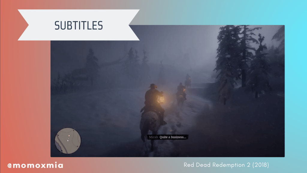
Subtitles derive from text within a written script or spoken dialogue. For example, if the dialogue is in another language, subtitles can provide a thorough and accurate translation for non-native speakers. Hearing individuals will use subtitles for varying purposes, such as understanding poor audio quality, heavy accents, or dialogue in a noisy environment. Not to mention, subtitles can also serve a functional purpose for those who are watching a video on their lunch break at work or trying not to wake a baby.
Here, in a quick example from Red Dead Redemption 2, we observe Micah, represented in gray, stating “Quite a business…”
The term “closed captions” is often used interchangeably with subtitles, but both features are different. Oftentimes, closed captions will include indicators for music or background noise such as explosions, gunshots, or breaking glass. As a tool, closed captions are almost always designed under the assumption that the user is deaf or hard of hearing.
The main benefits of closed captions is that they provide additional context and therefore, improve immersion for d/Deaf/HoH individuals. Users are able to focus more on the story and content, rather than spending their time trying to decipher subtitles and wondering what they might have missed.
Contextually though, when considering interactive media, we can include other ways to provide context for deaf and hard of hearing gamers. We’ll talk a little bit more about that later.
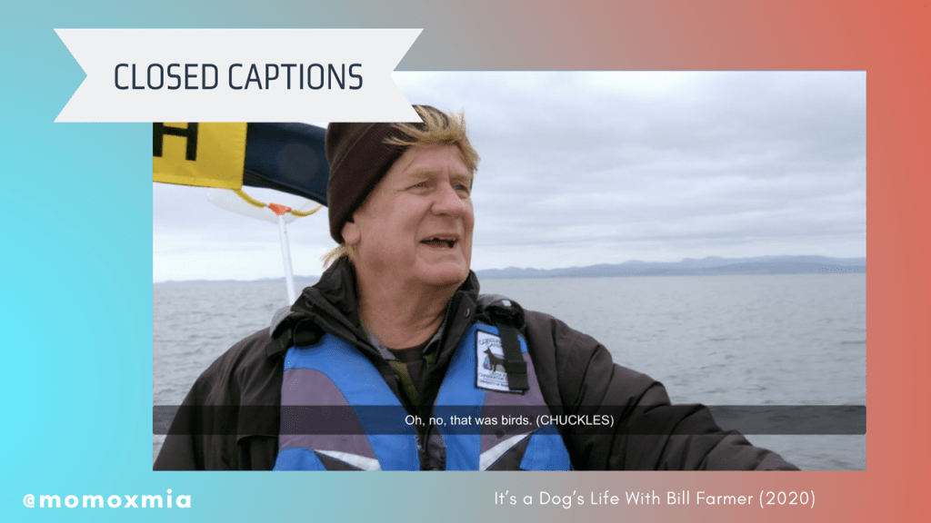
Here, in a quick example from It’s a Dog’s Life With Bill Farmer, we observe an unlabeled white man stating, “Oh, no, that was birds. (CHUCKLES)”. Notice how his laughter is captured within this closed caption, represented by the word “chuckles” within the pretenses. This lets deaf viewers know that the speaker has laughed, which provides context of his intonation–he is chuckling at his own words.
Now that we’ve discussed our first tool, what are some best practices? In the next two slides, I give a summary of best practices for subtitles and closed captions.
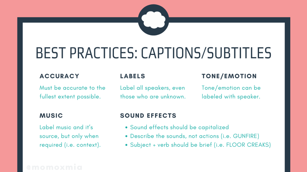
The first is accuracy, which states that all text must be accurate of the source material to the fullest extent possible. This means that all spoken dialogue and sound effects–if it’s closed captioned–must be accurately represented. From here, the next point is labels, which refers to labeling speakers within the text–even if the speaker is unknown. This is extremely helpful for off-screen dialogue.
Similarly the tone and emotion of the speaker can be labeled within the text as well. For example, the text can read JAN (WHISPERS) or JOHN (SLURS)–which again, provides some context to the intentions and emotions behind a character’s spoken words. More so, we should label music and it’s source, as well as only label mood music when required. This is especially relevant for games that have narrative-driven cinematics.
Lastly, for this slide, it is suggested to include sound effects within the captions. According to BBC, sound effects should be capitalized and should describe the sounds, not necessarily the actions. For example, rather than saying “GUN BEING SHOT IN THE DISTANCE”, we would say “GUNFIRE”. In the same nature, we want to make sure to describe the subject first, and then the verb. For example, we see the closed caption here, “FLOOR CREAKS.” Either way, the point is to minimize the amount of text on the screen, while also conveying pertinent information to the deaf viewer. We do not want to put any pressure in cognitive processing, so keeping things short and simple as possible makes things much more clear, while also helps keep deaf gamers immersed. Again, including the sound effects is especially crucial during in-game cinematics.
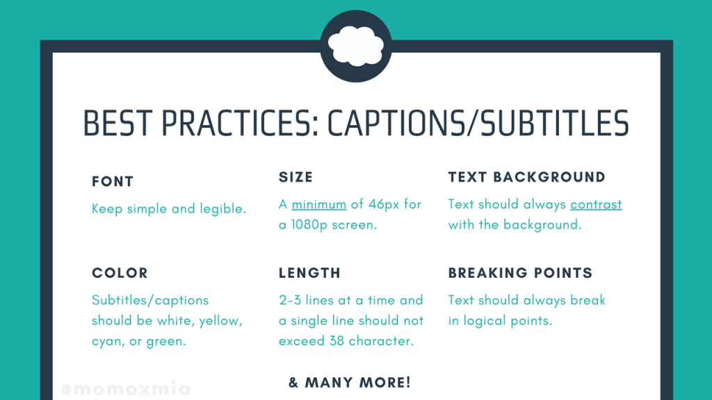
The next slide here focuses more on the technical details of captions and subtitles. For example, the font needs to be simple and legible. Additionally, the size should be at least 46 pixels for a 1080p screen. More so, the text should always contrast with the background and come in a variety of easily legible font colors, including white, yellow, cyan, or green. Lastly, there should only be 2-3 lines displayed at a time and one single line should not exceed 38 characters. Plus, the text should always break in logical points.
Now I realize that’s a lot of information, so I’m going to stick these slides on my website leahybaker.com for anyone to read over later. For now, let’s talk about some example to help us synthetize these best practices.
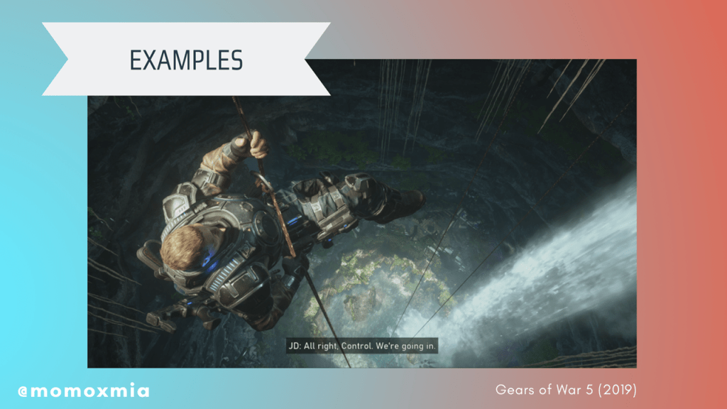
Gears of War 5 (2019): An example where the text is an appropriate size and the background properly contrasts with the text to improve legibility.
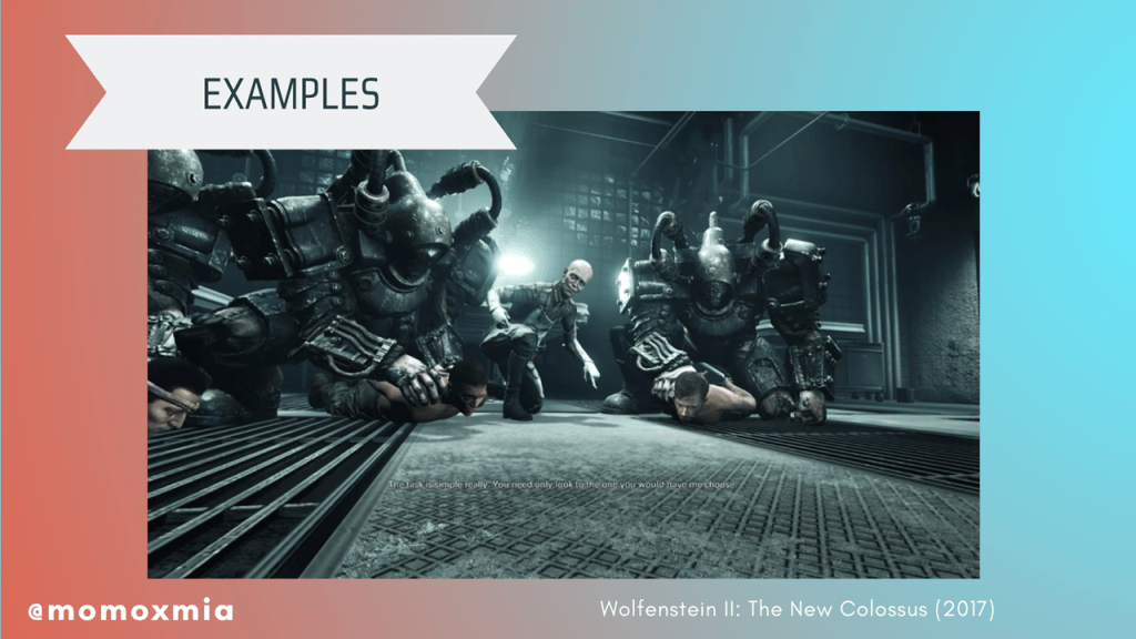
Wolfenstein II: The New Colossus (2017): An example where text is too small, the contrast between the background and text makes it illegible, and the speaker is not labelled.
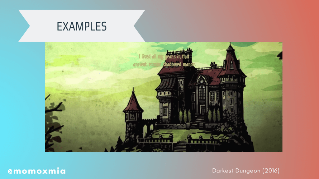
Darkest Dungeon (2016): The text is not a standard color and does not contrast with the background, making it illegible.
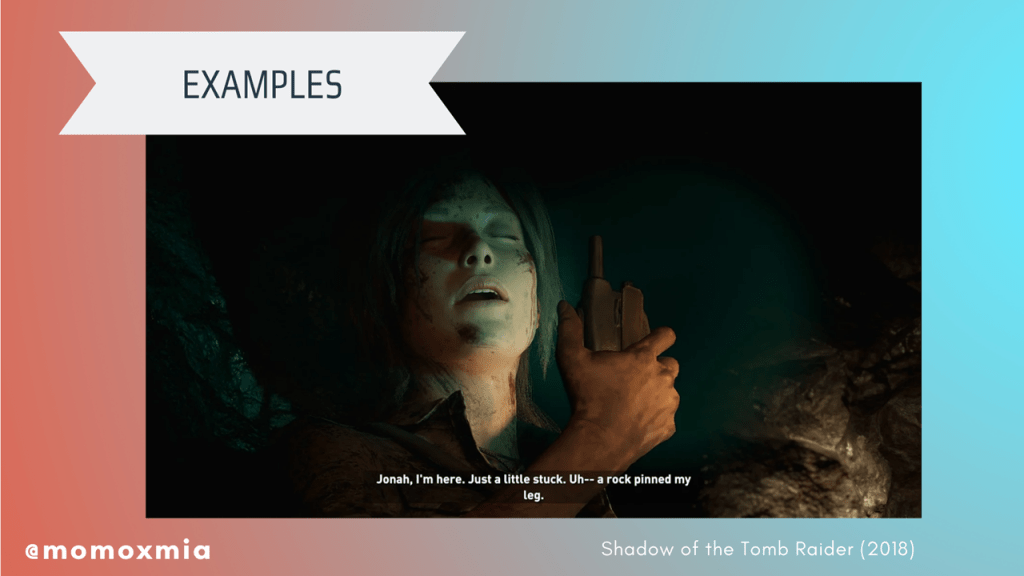
Shadow of the Tomb Raider (2018): An example where the text is properly contrasted and easy to read, but includes an arbitrary, unnatural line break.
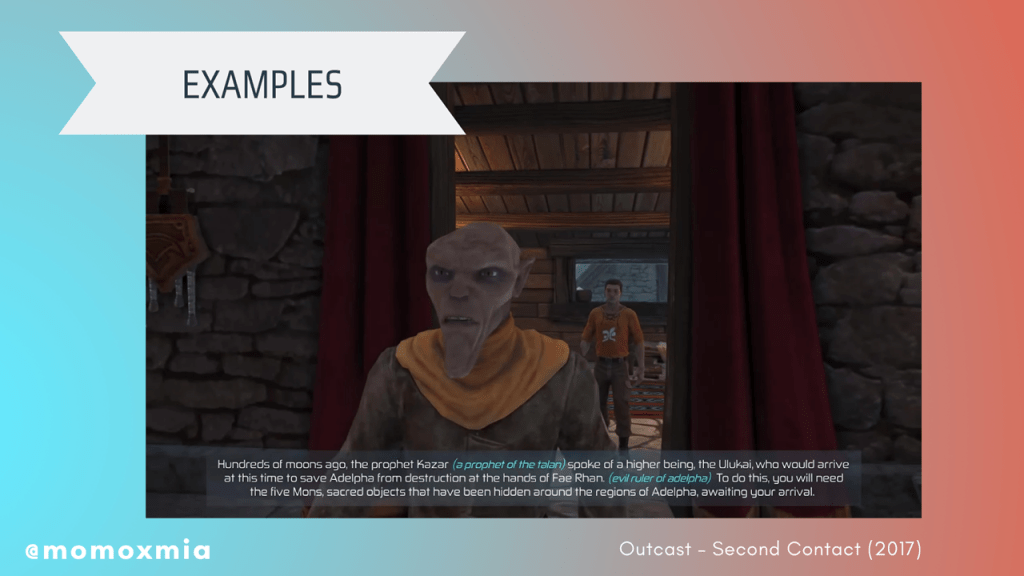
Outcast – Second Contact (2017): The text is too long for users to read and comprehend in an appropriate amount of time, thus slowing down gameplay.
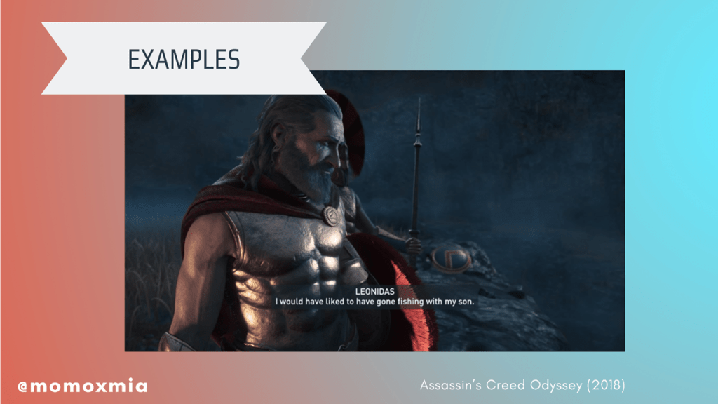
Assassin’s Creed Odyssey (2018): An example of text that is presented at an appropriate length, uses a clear text color with a suitable background contrast, and properly identifies the speaker.
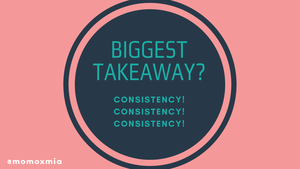
So what’s the biggest takeaway? No matter what you do, make sure to maintain consistency! Whether the team decides to use colors or brackets, make sure text is consistent. Doing so will ensure intuitive use for the product. Don’t be afraid to be experimental to see what works for your game. But at the end of the day, just make sure it is consistent and accessible.
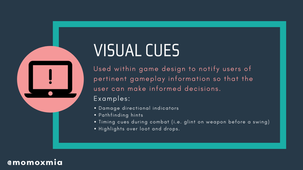
Now that we’ve talked about subtitles and closed captions, let’s move on to our second tool: visual cues. So what are they? Visual cues are used within game design to notify users of pertinent gameplay information so that the user can make informed decisions. They can come in many shapes, sizes, colors, and forms. For example, damage directional indicators, pathfinding hints, timing cues during combat (i.e. glint on a weapon before the enemy swings their sword), or just general highlights over loot and drops.
More often than not, designers will use visual elements that users are already familiar with, as doing so will make gameplay intuitive for users. Depending on the gameplay and designer’s intent, visual cues are often accompanied by a sound cue. But ultimately, visual cues are used within game design to notify users of pertinent gameplay information so that the user may make informed decisions. Let’s look at a few quick examples.
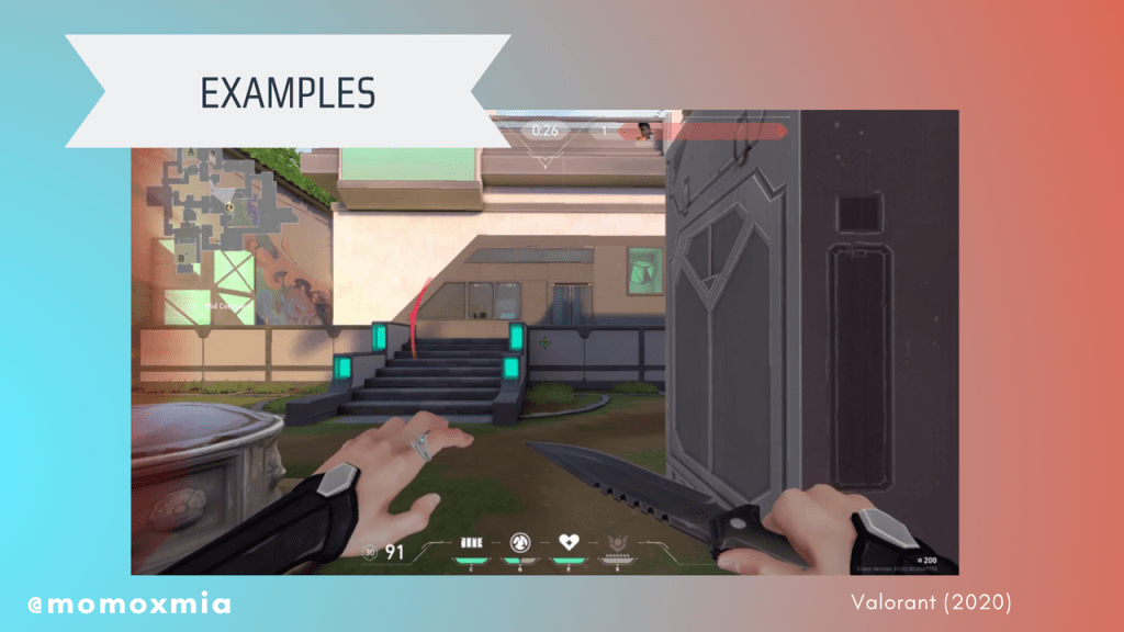
Valorant (2020): An example of a user taking damage and the game notifying the user through a damage directional indicator.
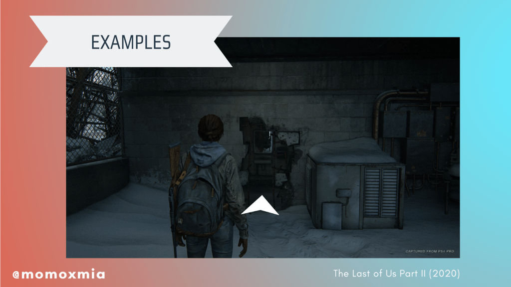
The Last of Us Part II (2020): An example of a user receiving a pathfinding hint to aid them as they continue through the story.
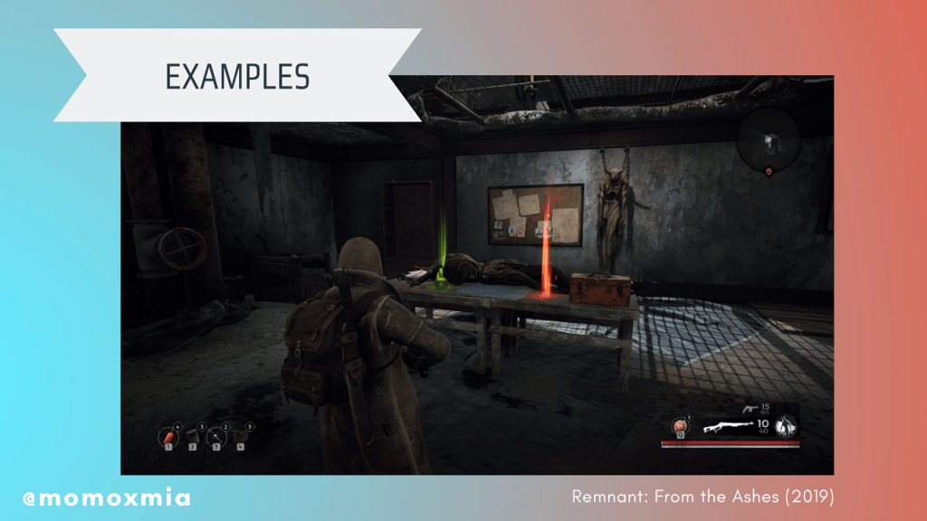
Remnant: From the Ashes (2019): An example of a user being visually notified of drops.
So now that we talked about our tools, why and when do we use them?
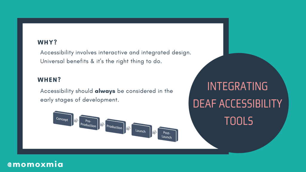
To answer the first question of why we use the Deaf Accessibility tools? we need to acknowledge that when it comes to Deaf Accessibility, there is no single solution. It’s easy to add closed captions and call it a day. But accessibility involves interactive and integrated design.
For example, only adding closed captions does not immediately equate to Deaf Accessibility. Hearing people’s processing speed index benefits from both visual and auditory processing. However, from d/Deaf/HoH individuals, auditory processing is decreased or removed from the picture.
To create a more accessible product, designers will need to add additional visual information to assist with deaf individual’s processing. The downside of only including closed captions or subtitles is that active reading takes up a large portion of cognitive flexibility. This might work for TV or movies, but we all know that in video games, players must be actively engaged and interacting with the product. What if the gameplay is unpredictable and includes lots of sounds? For deaf players, they’re forced into a multi-tasking dilemma and in the worst case scenario, can experience cognitive overload. They do not benefit from the interconnection between auditory and visual processing. This is why the Deaf Accessibility tools are critical and, more so, why there needs to be a healthy balance of both subtitles and captions with the visual cues.
To answer the when question, as in when do we add Deaf Accessibility? My short answer is that all accessibility should be considered in the early stages of development. The reasoning is that oftentimes, foundational design choices prevent the application of accessible features.
If I had to name an exact stage, then I would say the pre-production phase. Once the game enters production, it is extremely difficult to go back and say, “Hey remember all those sound effects we made? Turns out they aren’t accessible to deaf people.” Sure, it’s easy to add some subtitles, but what about all the other sound cues? There will be a lot of backtracking and potentially a lot of last-minute, imperfect solutions. And as designers and developers and producers, we don’t want that.
But now for the biggest question, how do we integrate these Deaf Accessibility tools? Now, I gave a lot of examples of subtitles, closed captions, and visual cues. But how does it all come together to make an accessible product for deaf gamers? To answer this question, I will walk through some examples and scenarios.
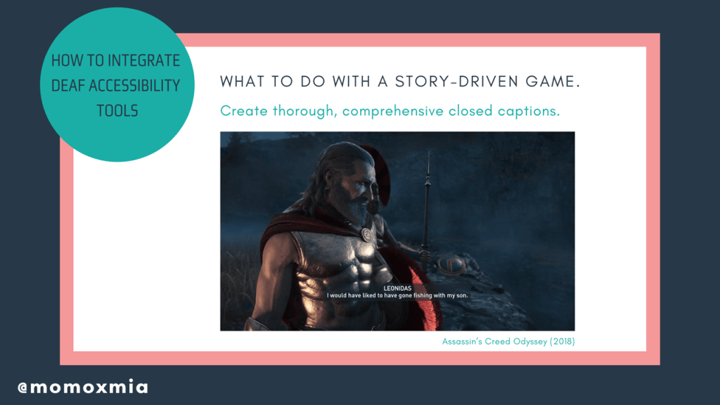
What to do with a story-driven game. If the gameplay is intended to be story-driven with extensive dialogue, then the designers need to create thorough, comprehensive closed captions. Here we can observe Assassin’s Creed Odyssey (2018), which includes detailed, comprehensive subtitles throughout the entire game.
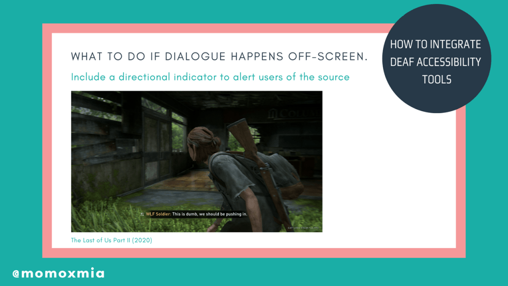
What to do if dialogue happens off-screen. If dialogue occurs off-screen, closed captions can include a directional indicator to alert users of the source. For example, in The Last of Us Part II, combat is subtitled and includes a directional indicator to let d/Deaf/HoH users know their enemies’ location. Here we have an example from The Last of Us Part II (2020), where the subtitles include a directional indicator. This notifies deaf gamers of where the source of speech is, so that they can re-situate themselves to look at the speaker or perhaps run for cover, should the speaker be an enemy.
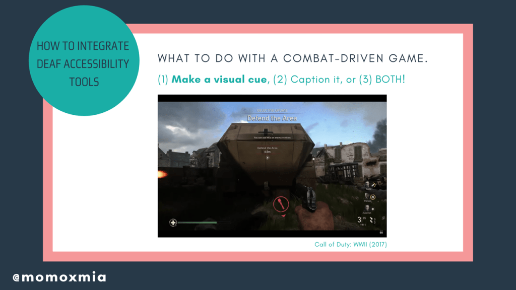
What to do with a combat-driven game. A major issue in combat-driven games is that off-screen events/alerts will occur, but will only notify the user through an audio cue. To make combat-driven games accessible, there are generally three choices: (1) Make a visual cue (1) Caption it or (2) Make a visual cue and caption it!
For the first point of make a visual cue, I provide an example from Call of Duty WWII, where Sledgehammer Games includes a directional visual cue to alert users that there is a grenade off-screen that could be dangerous.
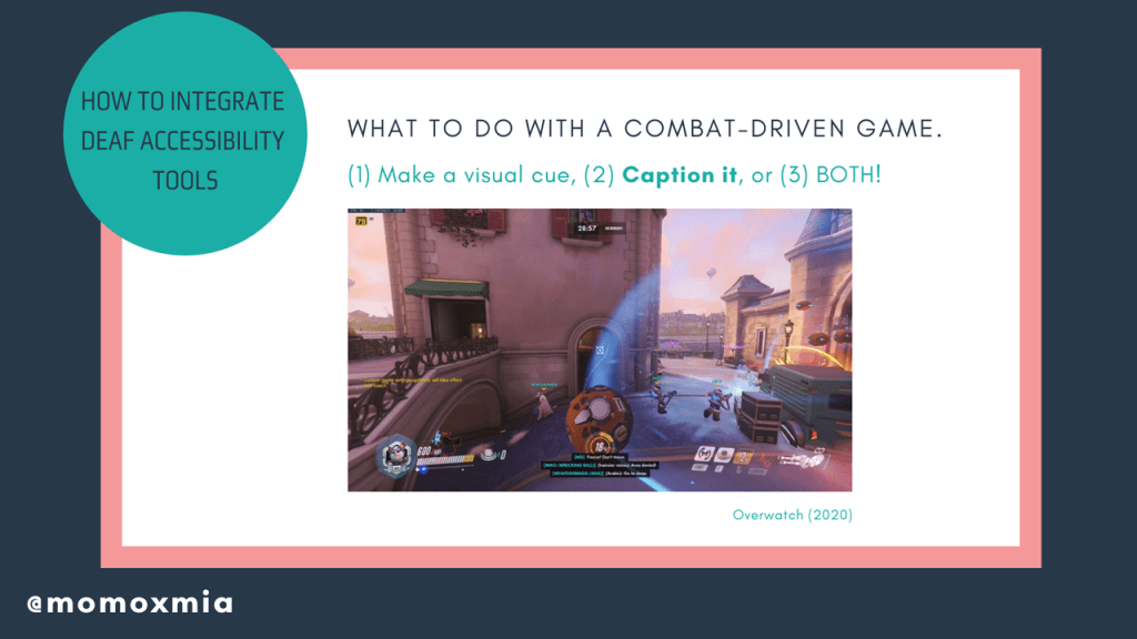
If events/alerts can be expressed through text, closed captions are a viable route. To optimize gameplay, closed captioning should include directional indicators. However, be mindful of “info dumping” text on the screen, as too many closed captions during combat may cause cognitive overload. Here, I provide an example from Overwatch, where key voicelines are included as closed captioned to notify users that an ability is being used.
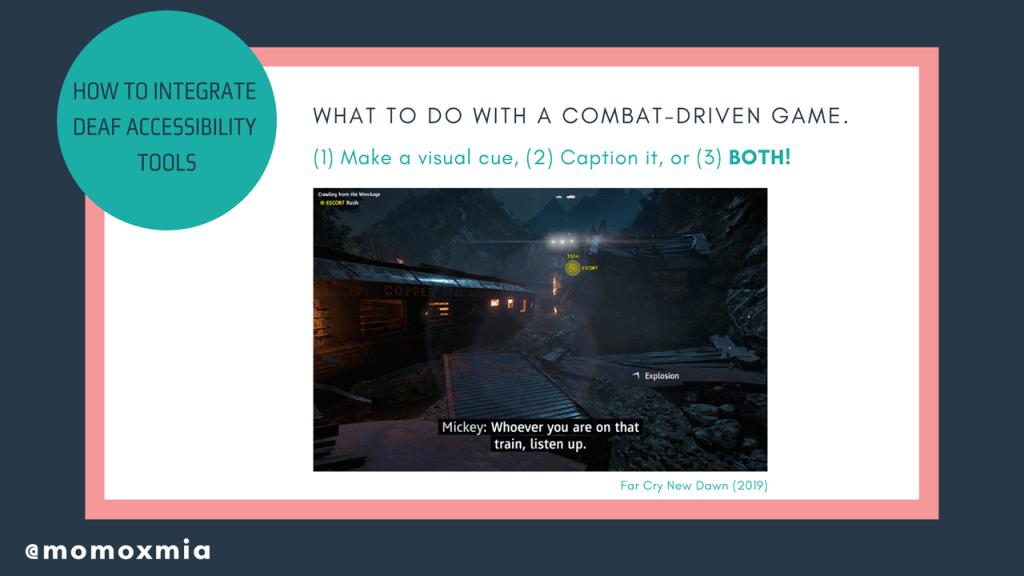
In other instances, a cue can be both visual and captioned. The benefit is that the user is alerted of off-screen events, while also receiving direct knowledge of what is causing the sound. For example, in Far Cry New Dawn (2019), in addition to dialogue being captioned, the off-screen “Explosion” visual cue is also captioned. For extra credit, they also include a directional indicator for the explosion, which provides further context for deaf gamers.
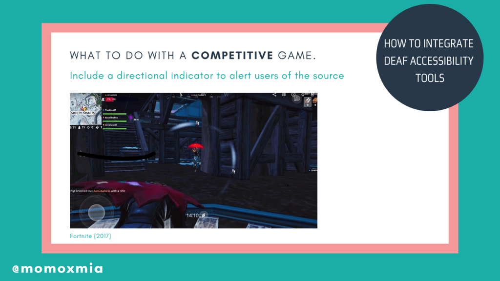
What to do with a competitive game. During a competitive game, users need to receive information as quickly and efficiently as possible. Typically, designers will use audio cues, as hearing individuals can subconsciously obtain information through subconscious, auditory processing. However, this does not work for d/Deaf/Hoh users. The best course of action is visualizing sound effects. Fortnite uses a revolutionary visualization for all sound effects. Within the visualization, there are visual cues such as treasure chests, gliders, gunshots, and footsteps. Additionally, colors within the visualization helps distinguish which sounds are neutral vs. dangerous. Opacity is also used to indicate distance of the sound.
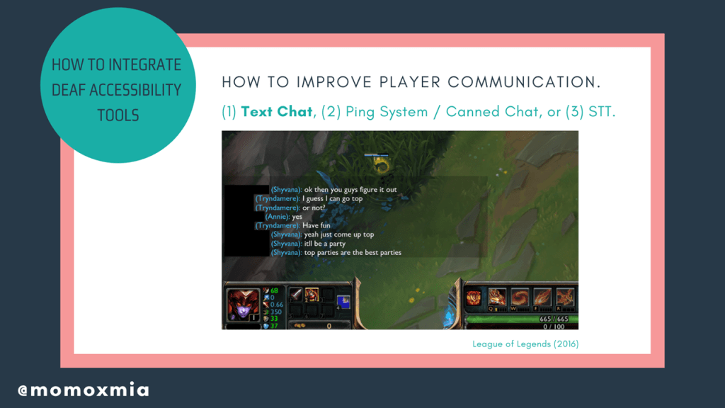
How to improve player communication. Team-based, first-person shooters are extremely popular these days and for many of these online games, they require player communication. However, voice chat is an obvious barrier for d/Deaf/HoH individuals. The first and most obvious solution is to let deaf gamers use the text chat to communicate with each other or clarify information. This is especially doable for slower-paced team games such as League of Legends.
But given the fast-paced nature of other online games, this is not always efficient. More so, text chat can inhibit users or place them at a disadvantage, as they spend more time reading/typing rather than searching for gear or engaging in combat.
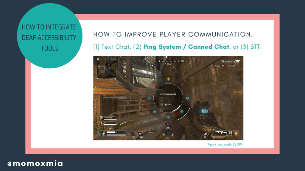
So what are some other solutions? Well on this slide, we see the suggestion of having a comprehensive ping system or canned chat. Having a precise and flexible ping system improves player communication, as users are able to quickly and efficiently provide information to their teammates. Plus, there are plenty of reasons people can’t or prefer not to speak in-game. Maybe their family is asleep, or they can’t afford a high-quality mic? Therefore, this is a universal solution that would not only benefit d/Deaf/HoH users, but also improve the game’s quality of life.
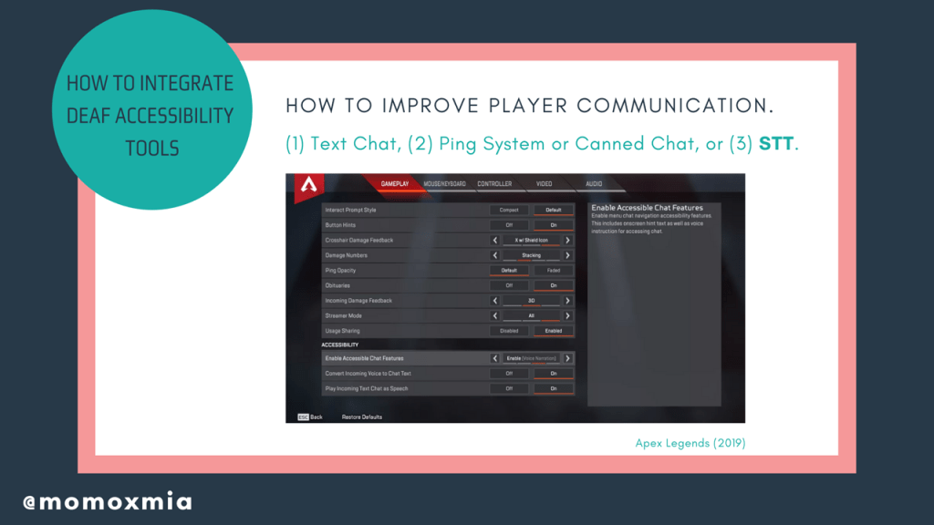
Another option is to convert speech to text. Though this solution is functional, there is a still chance the conversion is inaccurate due to poor microphone quality, background noises, accents, and incoherent speech. However, companies have proven it is good enough to show a substantial benefit for the d/Deaf/HoH communities.
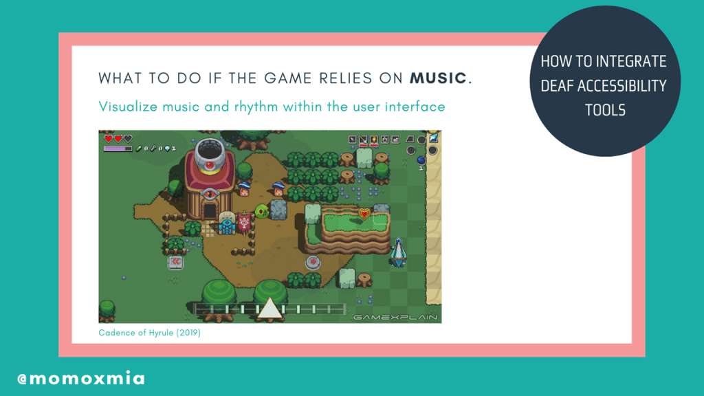
What to do if the game relies on music. This is a really common design question I get from people, largely because there are stereotypes that deaf individuals are unaware of music or rhythm. To clear the air, I can say with total confidence that deaf people know music and rhythm very well, and it is actually a large part of Deaf culture. But how can we make a music-based game accessible to deaf gamers as well?
Music can be visually represented in gameplay. Though Cadence of Hyrule is a rhythm game, Brace Yourself Games cleverly integrates a visual-heavy interface that relies on visual-audio cues. Notice that enemies pulse with the music, creating a visual cue that alerts users of the next move.
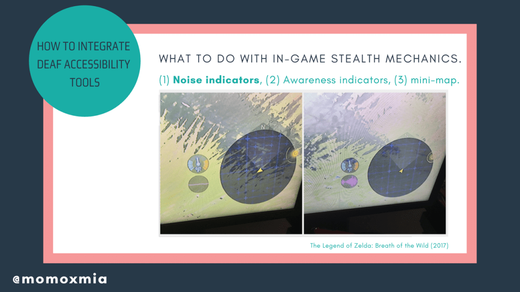
What to do with in-game stealth mechanics. Whether it be the user completing a stealth mission or an enemy sneaking up on the user’s character, a common pain point for d/Deaf/HoH users is in-game stealth mechanics.
My first suggestion is using an integrated noise indicator. For example, in Breath of the Wild, Nintendo added a noise indicator in their most recent Zelda installment (the circle with pink on the bottom left), which notifies users of their noise levels. Users may be unaware that one weapon is quieter than another. However, the noise indicator will notify deaf and hard of hearing users of their character’s noise levels, therefore serving as an extremely effective tool.
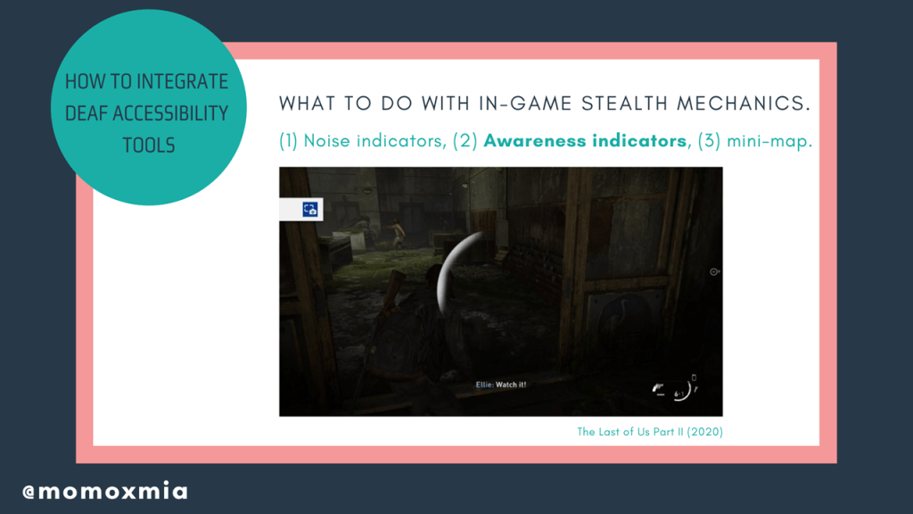
However, what do we do if an enemy is sneaking up on a user? In addition to integrating visual cues, designers can add awareness indicators. Awareness indicators will warn users when an enemy is about to spot them and from which direction the enemy is coming from. Awareness indicators assist in both stealth and combat, as it’ll let users know if an enemy is sneaking or charging up from behind them. Here we see an example from The Last of Us Part II, where the player is notified by the HUD that they are no longer in stealth and that an enemy to the left can hear/see them.
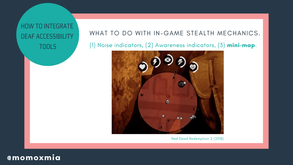
Another overall solution is adding a mini-map that identifies all enemy locations through visual cues. Doing so will paint a clear picture of all enemy locations, leaving less room for interpretation and more room for tactical decision-making. Here is an example from Red Dead Redemption 2, which has a mini-map that includes icons representing locations, encounters, and friendly/enemy players/NPCs.
Let’s quickly revisit what we have talked about today. The first tool we use is subtitles/captions, which is the idea of representing dialogue and sound effects through displayed text. The second tool is visual cues, which is the idea of notifying users of pertinent info so that they can make informed decisions. Between subtitles/captions and visual cues, there are so many creative ways to promote accessibility in video games. Today I have talked about a number of ways we can use these tools, but today’s presentation only scratches the surface of what we, as designers and developers, can do to make our games more accessible to deaf and hard of hearing gamers. Of course, this is not a set list, but rather a way to help you get started. And honestly? I look forward to our very accessible future.
As mentioned, this presentation and slides can be found on leahybaker.com, where I will continue to update it. Thank you for taking the time to listen to my presentation. If you have any questions or comments, feel free to email me at momoxmia@gmail.com or tweet to @momoxmia.
